work collection #2
A cat rescue website improvement project
User feedback revealed that BPCR’s website had outdated design and confusing information, particularly regarding the adoption process. My objective was to modernize the site and clarify adoption details to boost adoption rates. I used Jakob Nielsen’s 10 Usability Heuristics to identify issues in design, navigation, content, and error recognition, providing actionable recommendations to improve user experience and satisfaction.
Project Type
UX/UI Design
My Role
UX Researcher
UX/UI Designer
Information Architect
Tool Used
Figma
Contribution
User research
Persona creation
Journey map
Information architect
Wireframes
Low-fidelity prototype
High-fidelity prototype
Duration
8 weeks
define
Problem
The user feedback on the BPCR website before the testing shows that the website design is considered outdated with several information issues. Such as not having enough information about the adoption process that confuses the user when applying or the application form being unorganized and asking too many private questions.
objective
The Buddies Place Cat Rescue of Texas (BPCR) website project aims to boost adoption rates by addressing outdated design and information gaps in the adoption process. The assessment areas include completion rates for adoption applications, information clarity, goal achievement, and user satisfaction. The methodology combines heuristic evaluation, user research, and actionable recommendations to enhance the website's usability.
redesign
Goals
Adoption Rate Enhancement
Increase the adoption rate for the organization.
Information Error Reduction
Decrease the website information errors.
Positive User Experience Boost
Increase the positive user experience for the website.
Heuristic Evaluation
I applied Jakob Nielsen's 10 Usability Heuristics to evaluate the BPCR website, aiming to identify and resolve usability issues for improved user experience. The evaluation focused on three key aspects: Design and Navigation, Content, and Recognition and Errors.
Major usability problems
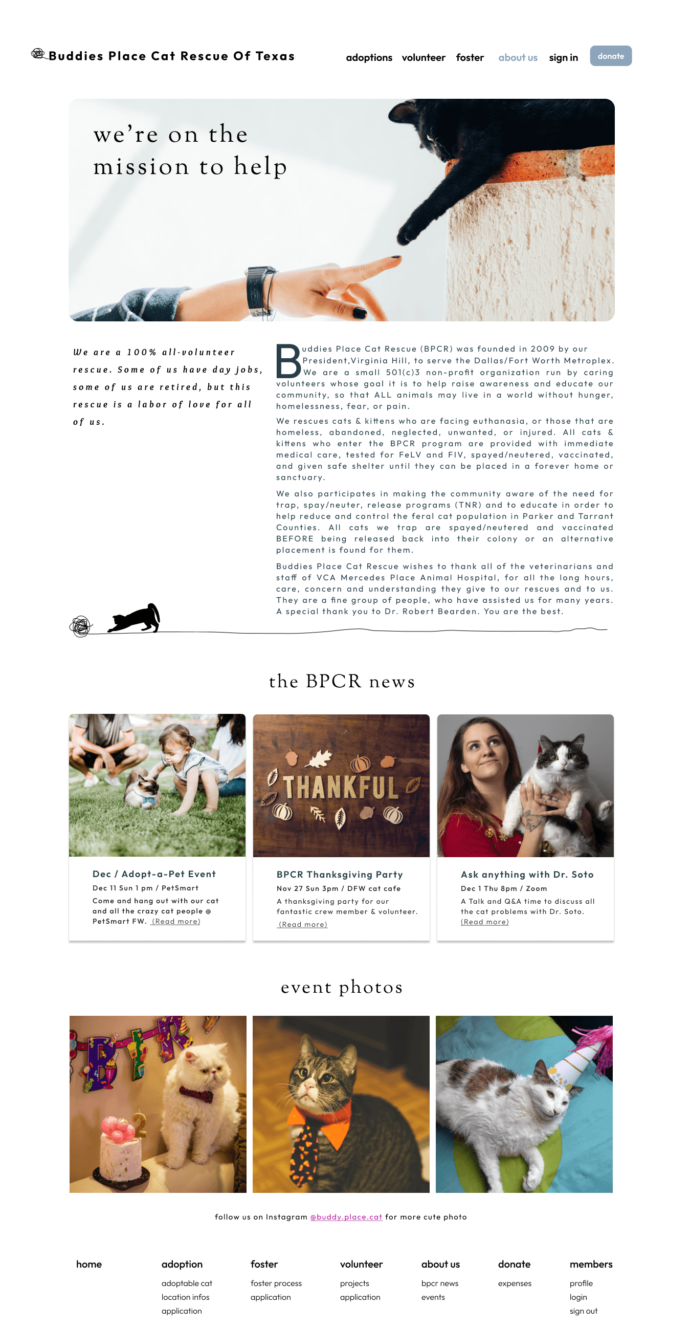
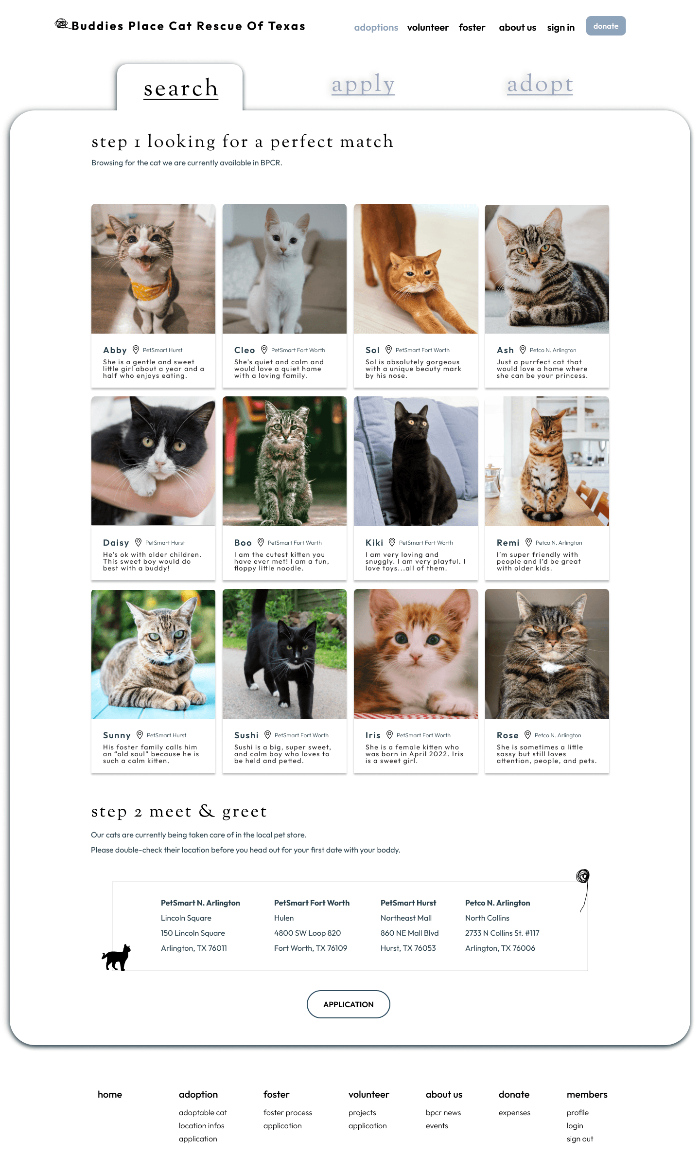
The website needs more detailed information on the adoption/foster process.
The application system doesn't offer suggestions or allow editing after submission.
Users must visit another site for animal photos, causing confusion.
Some page information attributes are not clearly classified.
The website needs a clearer navigation for applications.
The navigation bar text has low contrast.
Suggestion
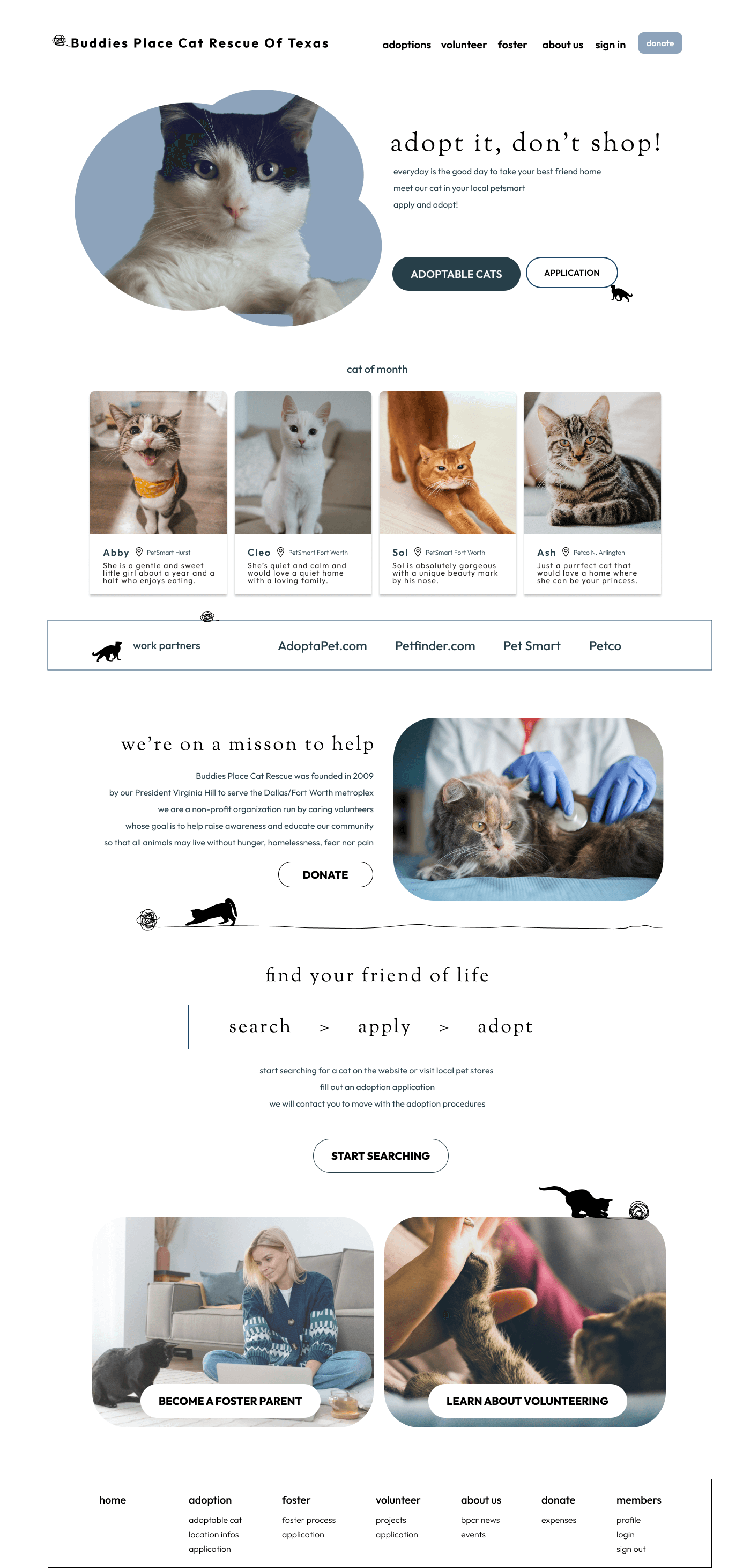
Offer detailed process information using photos or a flowchart to decrease staff response time to common inquiries.
Allow users to edit their submissions to prevent errors and save time.
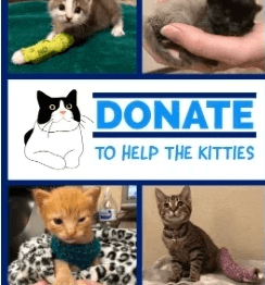
Display adoptable animal photos on the website instead of redirecting users. Create a photo grid with brief information and redesign the website's footer.
Use professional photos of animals and volunteers to enhance the website's visual appeal.
Restructure page elements for better readability and redesign call-to-action buttons.
Consider removing the "sanctuary" page.
The current design
The Buddies Place Cat Rescue of Texas (BPCR) website project aims to boost adoption rates by addressing outdated design and information gaps in the adoption process. The assessment areas include completion rates for adoption applications, information clarity, goal achievement, and user satisfaction. The methodology combines heuristic evaluation, user research, and actionable recommendations to enhance the website's usability.
An ineffective CTA
The call-to-action (CTA) buttons are photo links that are hard to find and unattractive.
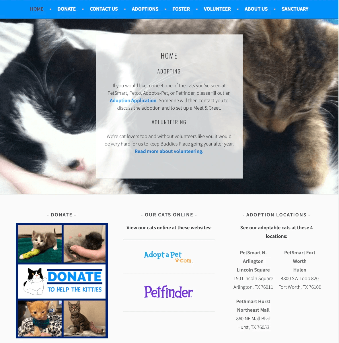
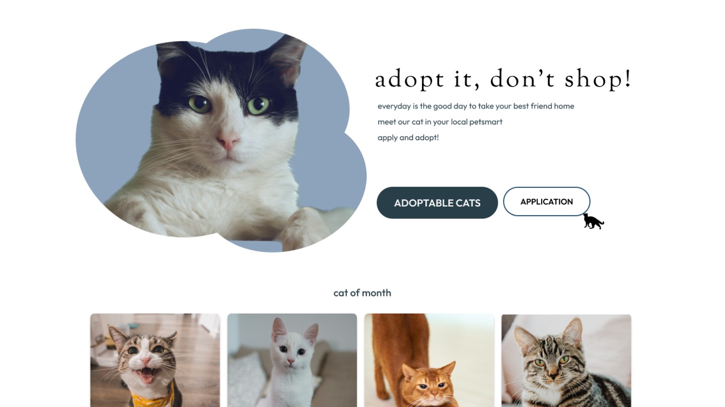
Poor Hero Section Design
The hero section of the home page presents crucial business information in a text-heavy design without an appealing image, and the information hierarchy is poor.
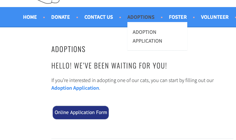
Lack of Adoption Process Details
There is not a lot of detailed walk-through or information on the adoption/foster process, and it also does not tell the user the next step after applying.
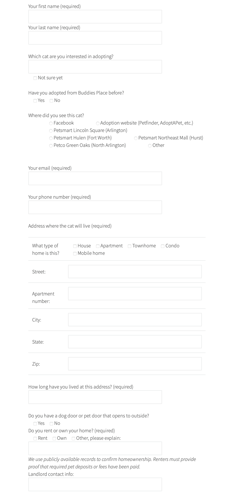
Long form to filling
User reports form length and question quantity causing fatigue and doubt in adoption applications.
After completing the heuristic evaluation, I conducted a user survey and interviews. These aimed to understand user interactions with the website, providing deeper insights.
RESEARCH
Overview
The survey collected insights from 12 participants, and two in-depth interviews focused on user interactions and task completion. Additionally, five representative users engaged in remote usability testing on Zoom. This holistic approach identified usability issues on the BPCR website, contributing to a thorough evaluation of user experience and system functionality.
survey
Goals
Completion Rates of Text-Heavy Forms
Evaluate the effectiveness of text-heavy application forms in terms of completion rates.
User Experience and Clarity
Determine if the information in the forms is self-explanatory and straightforward for users.
Adoption Process Efficiency
Assess the smoothness and ease of use of the adoption process for users.
survey
participant demographics
78.3% of the participants fell within the age bracket of 20 to 39 years old.
50% of participants have a bachelor's degree or higher.
58.3% of participants reported a household income between $25,000 and $50,000.
findings
83.3% of the participants had prior experience adopting animals.
75% of participants currently have pets in their household.
66.7% of participants like the color of the current website.
When confronted with the lengthy adoption form, participants expressed feelings of:
(1) Reluctance to complete all the answers, despite intending to do so.
(2) Impatience while filling in their information.
(3) Reluctance to provide too much personal information.
41.7% of participants find the text on the website is hard to read.
"I think the adoption application asked a few too many questions, and it gave the impression that Buddies Place was looking for a reason why you won't be able to adopt"
based on the research findings, the new BPCR website was designed with the following features:
Design Planning
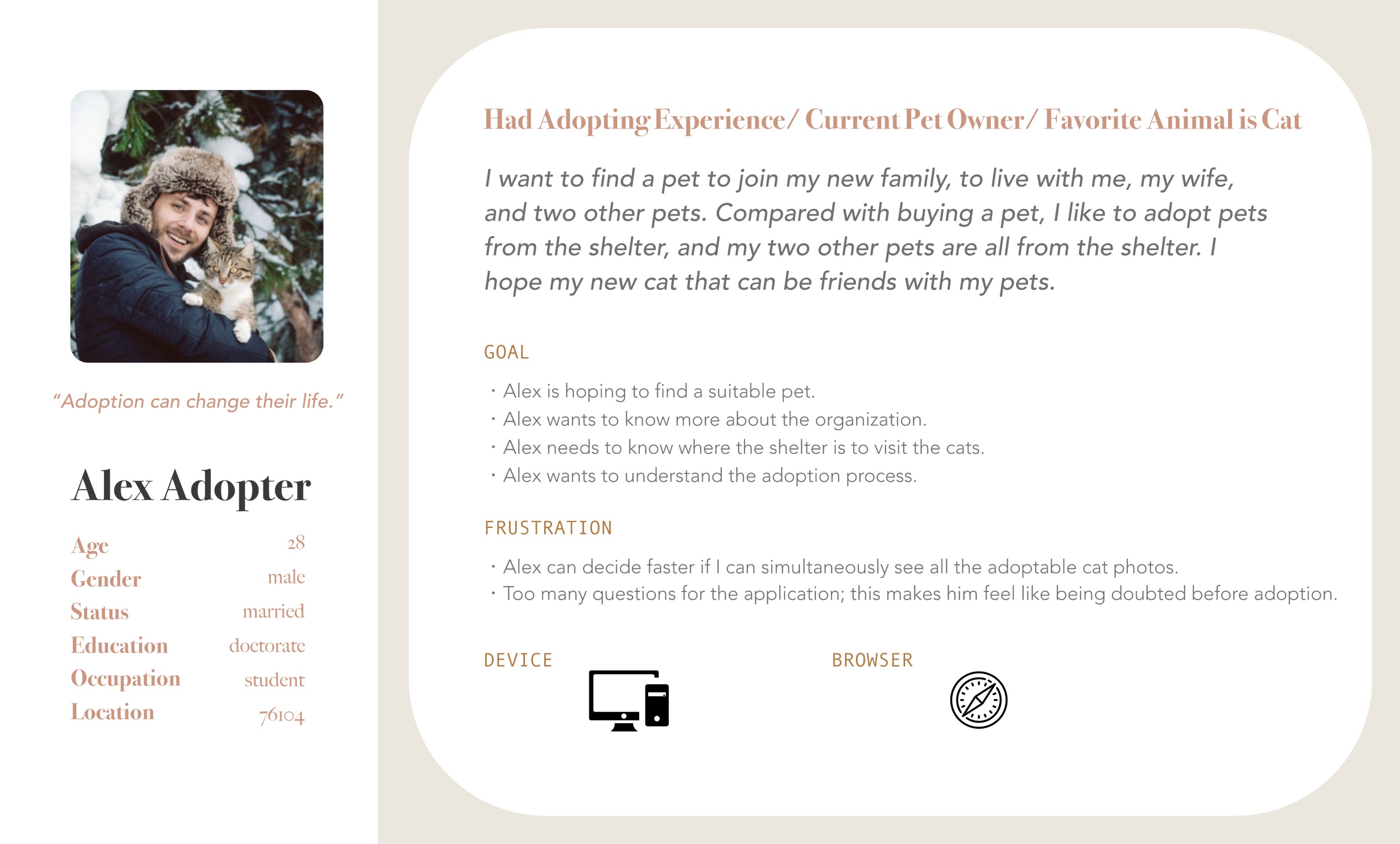
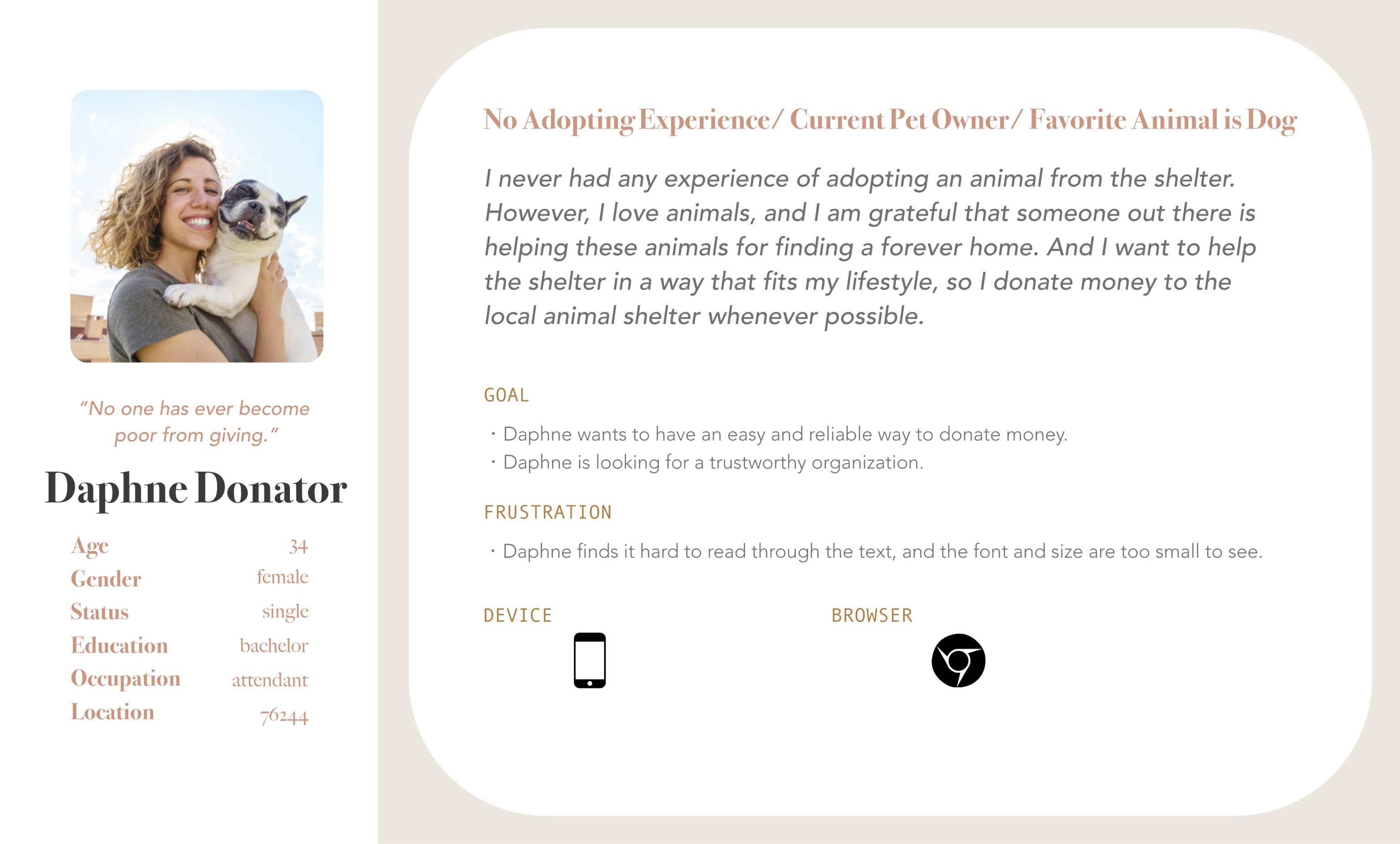
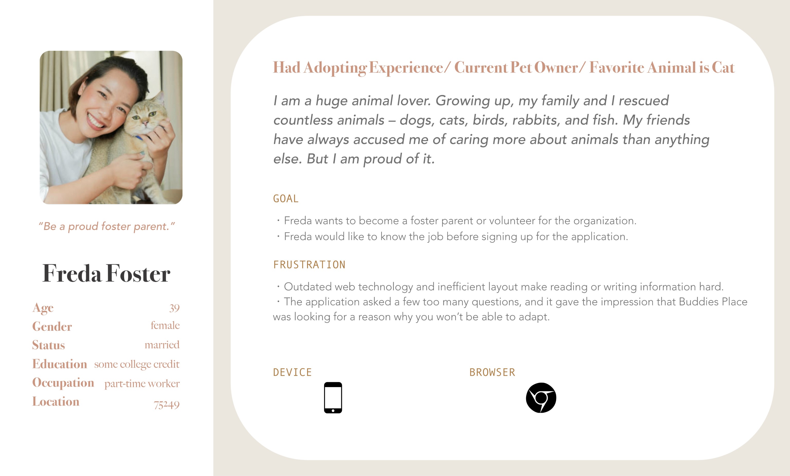
First I developed user personas using data gathered from surveys to humanize the potential users for the website.
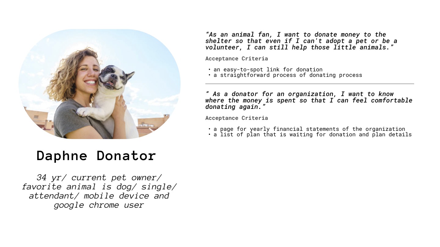
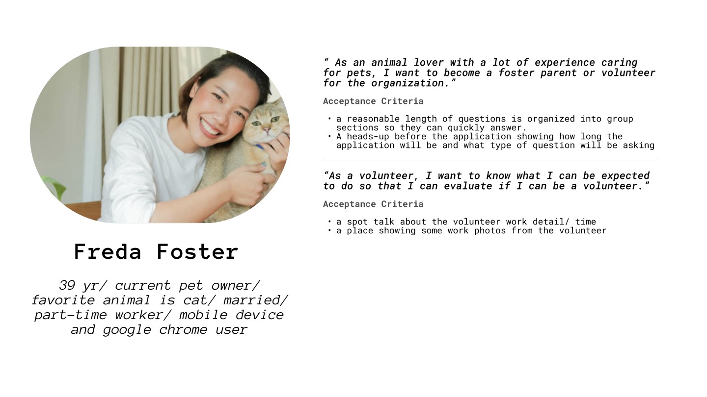
User Personas
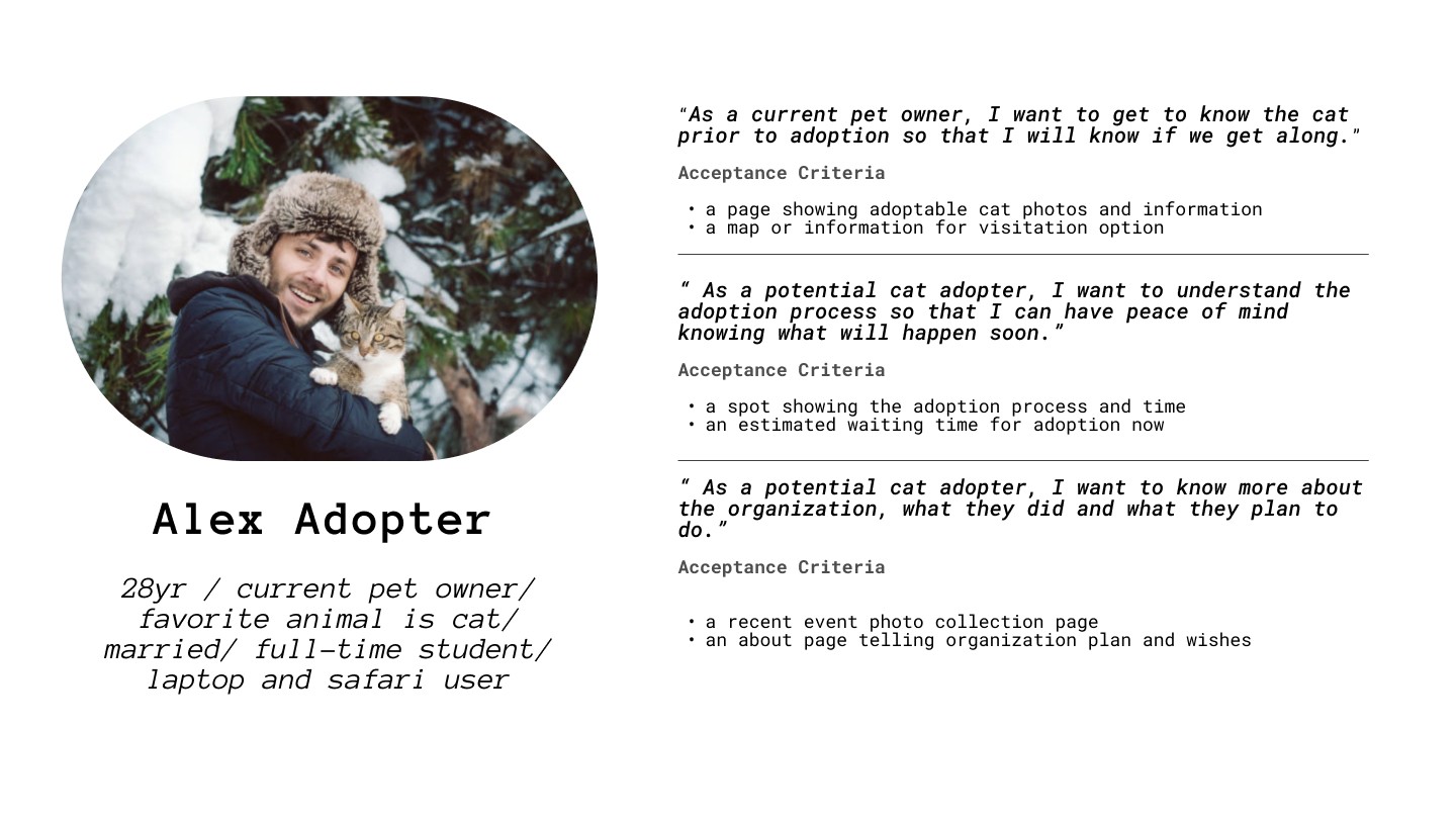
Then I created user story to highlighting pain points, needs, and opportunities for improvement throughout their interaction with a product or service.
User Story
To further enhance the usability and accessibility of the platform, I used an IA map clarified the app's design, demonstrating how information was organized and structured.